The Glass of Fashion and the Mould of Form
The unerring ability of sites to change their appearance completely between one visit and the next must surely be a feature of life on the Web that all but the most novice surfers have experienced. NISS's electronic residency over the years provides ample qualification for a 'new look' every now and then in terms of Web 'fashion', but it is hoped that the changes in 'form' that were introduced recently alongside a new visual appearance have helped to make the NISS site easier to navigate, and also created scope for future expansion in the range and value of NISS services. Whilst not striving to cover all aspects of the recent redesign, this article aims to supply some background detail about NISS's view of the process and the way that the new site should now look and work from your side of the glass ...
NISS has been in the business of providing electronic information services for, and from within, the UK education community for ten years and is supported in this work by the Joint Information Systems Committee (JISC). We have attempted to use and adapt new and emerging information technology to the best possible advantage throughout this period. Thus our initial text-only JANET services grew into Internet services and later into WWW services with graphics and colour. Technology and the information needs of our users continue to change however and the new look for our main Web service, implemented in mid-September of this year, is the latest stage in this ongoing development.
In common with any redesign process a number of often competing factors determined the final shape and form of the product - that product being our collection of Web pages and information files. In the period since the last redesign our Web service had continued to expand and provided access to a growing number of information resources from a diverse range of sources, and had also developed or refined the use of various aspects of WWW technology. Use of the Web is expanding generally and individuals and groups within education, as well as bodies outside the sector, continue to make contact with NISS with requests and queries about how we might help to make their information more widely available. This has resulted in a situation where NISS now works alongside bodies such as the Higher Education Funding Councils, the Office of the Data Protection Registrar, Hobsons Publishing plc, and the UK Government's Department for Education and Employment in the distribution of their information to the education community. Our success in increasing the number of 'partners' who work with us to provide information which is of value to that community, also helps ensure that we are able to provide access to a diversity of information which meets users' information needs.
The redesign process brought with it a chance to evaluate the current shape of the NISS Information Gateway (as the main service was then known) and see how it might need to be changed in order to better respond to the changing characteristics and demands of the technology, our information providers and users, and our strategic policies and aims. An important variable in information services such as ours is that of the user's focus, and the means by which we can help users easily identify the collections or resources they wish to access. We already offered access to particular groupings of related information resources from our service's home page but we realised that the focus on key or popular areas could be made more prominent visually, and so the new NISS home page [1] (illustrated here) features a layout which adds emphasis to the five major areas: Education, News, Reference, Noticeboard and StudentZone.
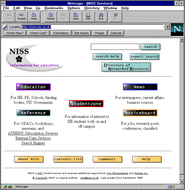
NISS home page
These areas together do not represent all the information resources available via NISS. However, the first four cover the collections of resources which had been identified in our strategic plans and are popular with users, and which had gradually evolved into their current format during the period that NISS has had a Web presence. The fifth, StudentZone, is a new service which is targeted at a particular section of the education community - the student body itself - and as such also required a separate identity and profile. Although individual information resources available via each of these areas vary greatly in terms of their content and presentation, they have been identified as being related by topic or interest and brought together under the five main headings. The selection of items can change of course as new resources come along, or older ones become out of date, and to accommodate this need for continual updating each area has its own Editor - that is a member of the NISS Information Team with responsibility for the maintenance of the information content within their area.
The greater clarity of focus on the five areas which is reflected in the layout of the new NISS home page should lead to a greater awareness amongst users of the types of information available via each one, and a corresponding appreciation of the different facets of NISS's online services. Each Editor operates within a policy and developmental framework with greater control than before over the way that their pages look and grow, and the areas have already adopted particular styles and a visual appearance which will no doubt continue to be refined over the coming months. These separate identities should help users to gain a feeling of familiarity with the sets of pages and a greater recognition of 'where they are' when visiting NISS services - users might have noticed for example that we have associated particular colours with each of the five areas, and these colours are carried through the pages via graphical or textual features. There are of course some shared features too, such as the buttons for "Comments", or "Expert Search", and a small "NISS" logo which serves as a link back to the NISS home page from most lower level NISS pages.
In addition to changes in the visual appearance of the area pages there has also been some restructuring of the data within the areas, although this has been kept to the minimum and very few URLs were altered as a result of the redesign process. The Editor of the Noticeboard area [2] (see illustration) for example, notes that:
"The main aim was to give users improved ease of access to the ever broadening scope of information available in this area. To this end a side navigation bar was added to the Noticeboard main page so that users can move directly to the index page for each sub-section. Links to individual areas within a sub-section were also added to the main page to allow users to move directly to specific pages without having to work through several levels, and they also serve to indicate the type of information available in each sub-section. At lower levels the side navigation bar shifts to a horizontal alignment at the bottom of pages to allow quick access to different areas without having to go back to the top index page of the Noticeboard area."

NISS Noticeboard area
The Education area [3] posed a different set of problems and the Editor here reports that:
"Before redesigning the area, we undertook a consumer survey, which showed clearly that although a lot of users saw NISS Education (see illustration) as a route to other institutions, there was also significant usage of all the other areas of information provided. People liked the clear, low graphic, layout but there was a general feeling that the existing 'starting point' pages were too long. There was also a desire here to broaden the information we held for the benefit of the other (FE and Schools) sectors, and we needed a structure which would allow us to do this."
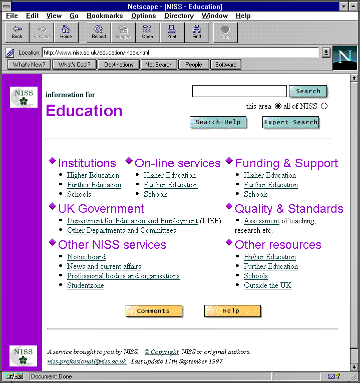
NISS Education area
"Some of the information available via NISS is only relevant to one sector of the education community, whilst other items have relevance to two or more sectors. Users may come looking for information from their own sector, or from one of the others. Some users are not aware that there is a difference. So we had to provide access for a broad spectrum of need, in a way which made the choices obvious, within a confined space. We were also aware of the wide range of both browser software and hardware in use within the community, and aimed to design the pages so that they would be as accessible to as many people as possible."
The new Reference area pages [4] echo some of these design themes as well, for the Editor comments:
"The redesign has also introduced a much shorter main page here than before (see illustration), although the area has in fact expanded to include the former Datahosts collection (now called 'External data services'), a link to ATHENS Subscription Services - with additional information about NISS's ATHENS authentication service available here too - and a new section for Travel information links. The link to the library catalogue pages has been given more prominence on the area main page, and further consolidation of the various OPACs listing pages is also under consideration. The area as a whole is set to grow as further reference material becomes available."
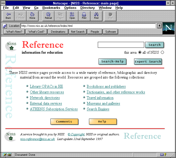
NISS Reference area
The News area [5] (see illustration) continues to expand too, and the redesign process provided the opportunity for the separation of the area's various sections into their own pages, thereby making maintenance more straightforward, and navigation to the collections of links is clearer now than before. The range of newspapers and journals available via this area has increased greatly, and a large amount of world-wide material of this sort is now available.
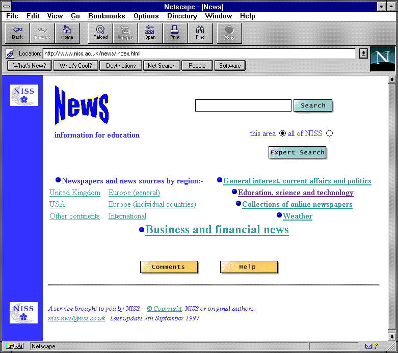
NISS News area
Since StudentZone [6] (see illustration) is a completely new service we were able to start the design process in this case free of any constraints imposed by existing pages or resource collections. The StudentZone Editor explains that:
"The service was built with the aid of university students from a number of institutions and NISS also collaborated with organisations such as the NUS. Further partnerships of this nature are planned to ensure the continued growth of the site.
It was uppermost in the developer's minds to ensure that the site could be easily navigated by web beginners and experts alike. It was for this reason that the use of frames was considered and finally approved, with the StudentZone home page displaying the nine subject sections in a short colour-coded index. All this with the welcoming page, gives students an overall picture of what StudentZone provides before each user diverges into the different areas for the information they require.
> 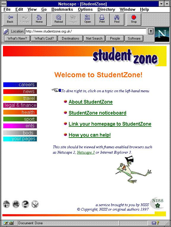
StudentZone service main page
"The site now has a good overall structure with over 3,000 links, but as always things can be improved. The future development of StudentZone is still being finalised, but it has become obvious that the current screen formatting will not be flexible enough to display sufficient information on all occasions (this is already the case with pages such as Club Football links and News about Institutions). Therefore we plan to change these information documents to full size Web pages, and provide appropriate links to them via new pages which will themselves be kept frame-sized to reduce the number of scroll bars appearing on the screen.
"Other proposed enhancements include an academic section where students can talk about their studies, share information or read about the latest developments in HE. This facility would complement NISS's Education and Reference services and hopefully help increase students' knowledge of and perhaps their 'voice' within the Higher Education sector. The most important source for future development is of course students' own ideas and suggestions, and these will be used where possible. We have already rearranged the presentation of student home pages following comments from users, and hope that more students will get involved, making the site much more their own 'domain'."
One other important area of NISS which has also been given a new look but not yet discussed here is the "Directory of Networked Resources" [7]. The Directory pages can be accessed via a button near the top of the new NISS home page and they allow exploration of all the 'classified' resources available via NISS. You can browse for resources via an alphabetical subject listing, by UDC shelfmark order, or via hierarchic UDC listings.
As well as offering access to the Directory of Networked Resources, the cluster of buttons at the top right of the NISS home page also provide access to the NISS search facility. Search was further developed prior to the release of the new look NISS pages, and you can now choose either a simple search - where you key a search term into an input box that is generally available on the Web page adjacent to the 'Search' button - or alternatively you can follow the 'Expert Search' button which takes you to a separate search form which lets you build more complex or refined searches. Expert Search gives the option, for example, of applying your search terms to text on NISS Web pages (the NISS Services option), to NISS Resource Descriptions (i.e. records in the database of classified resources which forms the core of the service), or to records in the NISS NetFirst Service (available only to education sites participating in the CHEST agreement for NetFirst). The search facility is a valuable way of finding resources and information which is available via NISS, and is now more extensive and helpful than it was prior to the redesign of our pages. Editors have ensured that access to the search facility is also available via their pages within the Education, News, Noticeboard and Reference areas. This NISS-wide search facility will become available from the StudentZone pages at a later date where search currently operates only on the StudentZone pages themselves.
Throughout the design process we endeavoured to uphold a number of guiding principles which we believe are important features of NISS's online services. These include the fact that although NISS will clearly not be able to provide all the information all its users might ever want, we aim to provide at the very least an invaluable starting point for users' online exploration - if we don't have the precise information you need, then we hope that we can point you towards a site that might answer your questions. Another feature is that we aim to provide quality information which is of value to the education community - and our resource descriptions (accessible via the 'standard' [Info] links) help users decide whether a particular resource may be what they are looking for before they need to connect to it (a time-saver when network traffic is heavy). We also try to ensure that information is presented in the most appropriate and useful way - for example, a series of documents from the Higher Education Funding Council for England can be both browsed and searched. In addition, our work with partner information providers helps sustain both the quality and diversity of information available via NISS services and hence also ultimately benefits users.
Identifying and responding to the ever-changing needs of our users remains a fundamental activity for NISS, and any redesign of our services needs to take these requirements into consideration. The higher profile given to the five Editorial areas in the new design has we believe, addressed some current issues concerning identity and ease of use, and will hopefully bring future benefits too in the context of a more focused relationship between users of a particular area and its Editor. All the Editors value feedback from users and the simplest means of establishing such contact is via the Comments button that is included on most NISS pages and which directs the email message to the individual who edits those pages. NISS calls on other groups within the community for advice and feedback too - one case in point being the design process itself, during which members of the NISS User Group commented on our emerging ideas about the new look. Our new service, StudentZone, was also developed as a result of collaboration and consultation with interested groups within the education community.
The Editor areas will grow, adapt and change as time goes on, as will all of NISS's services. Each change that is presented to the user is, we hope, an evolutionary step towards a better service more appropriately harmonised with user requirements and the available technology. NISS's wide and varied user-base, in terms of information needs, computing expertise, and accessibility of computing equipment, means that we constantly have to try to balance a number of features and factors when creating and maintaining our services. Much as we may wish to, we can never please all of our users all of the time - each person works to their own agenda when looking for information - but we always aim to meet the requirements of the majority. We hope that Web fashion and form have successfully combined in the recent redesign of the NISS site to produce services which will continue to be useful and accessible to staff, students and administrators throughout education.
References
[1] NISS home page
http://www.niss.ac.uk/
[2] NISS Noticeboard area
http://www.niss.ac.uk/noticeboard/
[3] NISS Education area
http://www.niss.ac.uk/education/
[4] NISS Reference area
http://www.niss.ac.uk/reference/
[5] NISS News area
http://www.niss.ac.uk/news/
[6] StudentZone
http://www.studentzone.org.uk/
[7] Directory of Networked Resources
http://www.niss.ac.uk/subject/
Author details
Annette LaffordInformation Officer
NISS
Email Annette.Lafford@niss.ac.uk
and the NISS Editorial team (Simon Call, Catherine Humphrey, Oren Stone, Liz Struzyna)
