The Third Annual edUi Conference 2011
Danielle Cooley reports on the third annual edUi Conference, held over 13-14 October 2011, in Richmond, Virginia, USA, an opportunity for Web professionals in colleges, universities, libraries, museums, etc to discuss the latest developments in Web trends and technologies.
The third annual edUi Conference [1] was held October 13-14, 2011, in Richmond, Virginia, USA. The sold-out event saw 225 ‘Web professionals serving colleges, universities, libraries, museums, and beyond’ join together to discuss the latest and greatest in Web trends and technologies. The all-volunteer conference was presented by the Virginia Foundation for the Humanities, and major sponsors included Microsoft, the University of Richmond, and Virginia Commonwealth University.
The two-day event consisted of four tracks [2]:
- For beginners, ‘Web 101’ addressed fundamentals of user interface and user experience design and development.
- The ‘Toolbox’ track provided information about specific tools or technologies.
- ‘Problem Solved’ included a variety of case studies from the higher education Web world.
- ‘The Edge’ covered such emerging technologies as HTML5 and CSS3.
Included in the conference registration for each delegate was one of four half-day workshops representing the four conference tracks:
- Kicking Off Your Content Strategy (Web 101) by Margot Bloomstein
- Progressive Prototyping (Toolbox) by Matt Ventre and Todd Zaki Warfel
- Designing Mobile Experiences (Problem Solved) by Brian Fling
- Practical HTML5 (The Edge) by Christopher Schmitt
Keynotes were provided by Siva Vaidhyanathan (‘The Googlization of Everything’) and Jeffrey Zeldman (‘Content First’) [3].
This article summarises some of the presentations and the prevailing themes of the two-day event.
Thursday, 14 October 2011
Plenary: The Googlization of Everything
In his opening address to the conference, Siva Vaidhyanathan of the University of Virginia discussed the research involved in writing his book The Googlization of Everything: (And Why We Should Worry) which appeared in March 2011. As the book and presentation titles suggest (and we all understand), Google has its corporate fingers in just about everything – search (Google, of course), online video (YouTube), blogging (Blogger), mobile (Android), mapping (Google Maps), restaurant reviews (Zagat), photos (Picasa, Picnik), and so much more. Between these tools, Google Docs, Gmail, and Google Checkout, you can spend just about your entire online existence on various Google-owned tools and not miss out on too much. They even own security (reCAPTCHA) and facial recognition (PittPatt) tools.
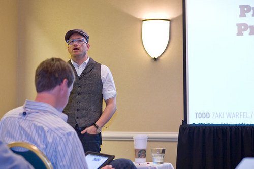
Figure 1: Todd Zaki Warfel leading his session entitled Progressive Prototyping – Condensed. Image courtesy of fhwebdev.
But power corrupts, and absolute power corrupts absolutely. Google says its motto is ‘Don’t be evil.’ (Actually, it turns out they never officially said that, but it’s a fair description of their supposed philosophy.) But in the end, Google is a publicly traded company, and their primary goal is to make as much money as they can. And, since we have put all of our electronic eggs in Google’s basket, we won’t have much recourse if they do decide to be evil.
Indeed, Google’s ubiquity can be dangerous in many ways.
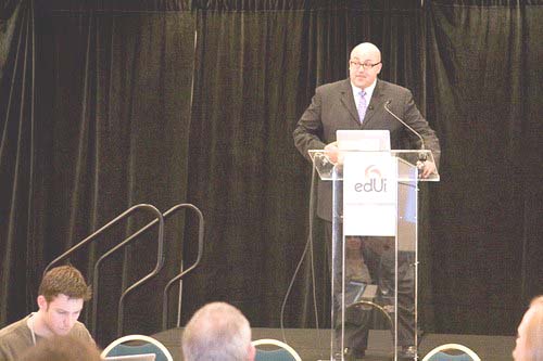
Figure 2: Siva Vaidhyanathan presenting his plenary address. Image courtesy of fhwebdev.
Web 101: Web Building Blocks: Core Concepts for HTML and CSS
In this one-hour presentation, Joseph Gilbert of the University of Virginia provided an overview of HTML and CSS and how both have evolved over the years. Intended for the novice developer, the presentation laid out the basic philosophy behind HTML and CSS, and described how they should be used properly to maximise usability, findability, and accessibility.
He first described the inherent hierarchical nature of HTML. The <title> tag is a child of the <head> tag, for example. <h1> and <p> belong in the <body>, and everything gets wrapped in an <html> tag set. He provided a brief explanation of several different specific tags, including <div>, <span>, <a>, <img>, <h1>, <p>, <ul>, <table>, and <em>.
He emphasised the importance of semantic mark-up as well. The <em> tag being a better alternative to the <i> tag, for example, since it provides some information about the content being tagged. Other tags commonly (mis)used purely for presentational effect are <b>, <table>, and <br>.
Joseph then illustrated the evolution to the more natural language of HTML 5, showing that ‘<div id=”header”>‘ in XHTML is now just ‘<header>‘ in HTML5.
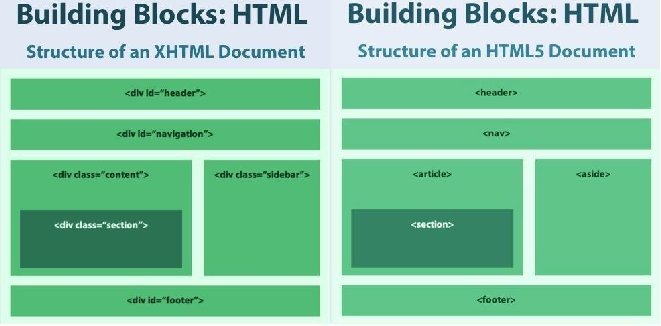
Figure 3: Side-by-side comparison of XHTML and HTML5 layouts (courtesy of Joe Gilbert)
Moving on to CSS, we started with some basic syntax of various selectors. The concept of inheritance was explained, as were such properties as height, width, colour, font, float, padding, and margin. Joe illustrated how CSS can be used for both normal and relative positioning of screen elements and content blocks, including floated elements and cleared floats.
While I had hoped to leave the session with the ability to write a line or two of good, up-to-date HTML/CSS, that was not to be. But the presentation did provide an excellent overview, and it will be helpful background to have when exploring online tutorials from places like W3Schools or A List Apart.
Problem Solved: Hoarders, Library Website Edition: A Data-Driven Website Redesign in 120 Days
Harish Maringanti, Joelle Pitts, and Tara Coleman from Kansas State University Libraries presented a case study of their recent redesign project. After identifying issues with the current state of their Web site, they identified five key user groups to inform the redesign. Using analytics and qualitative methods, they determined that much of the 3,000+ page site was seeing little to no use and determined that much of the content could be eliminated.
Not so surprisingly, the team encountered resistance when they asked content owners to make a ‘keep, modify, or archive’ decision about each piece of their content. Content owners wanted to keep pages that had been viewed only twice over the course of a year or more, ‘just in case’ anyone wanted that information later. In the end, the redesign team had to make some tough decisions for the greater good. (As founder of the ‘Less Content, More Strategy’ movement, I found this to be a particularly interesting development. The inclusion of the term ‘hoarding’ in this presentation title is apt, as much of the psychology of hoarding possessions also applies to hoarding Web content.)
Then, just when they were about to roll out their thoughtful, user-centred redesign, the University released a new set of Web standards that all departments were to follow. Unfortunately, this development kept them from achieving success in the initial 120-day timeline, but the team was able to take what it had learnt and produce rather quickly a new site that both supported their user groups and conformed to the University’s new guidelines.
Web 101 Workshop: Kicking Off Your Content Strategy
Margot Bloomstein of Appropriate, Inc. began this workshop with a basic introduction to Content Strategy – a definition (‘Planning for the creation, aggregation, delivery, and governance of useful, usable, and appropriate content in an experience.’), explanation of its purpose (keeping projects focused and easing the future tasks of maintenance and revision), and a brief ‘how-to’ (Message Architecture, Content Audit, style, metadata, and governance guidelines).
The workshop then went into further detail about how to create a message architecture, including a fascinating example from Mini USA. The message architecture is helpful because it is relatively inexpensive to produce and serves as a guiding document for all future content – text, graphics, photography, microcopy, tweets, traditional advertising – everything.
Workshop participants got to experience an attribute-sorting exercise in which a hypothetical company’s message architecture was derived from a set of approximately 250 adjectives (‘fun,’ ‘compelling,’ ‘trendy,’ ‘formal,’ ‘relaxed,’ etc.). Each adjective is printed on an individual card, and stakeholders sort them into groups of adjectives that do and don’t represent their desired message.
From there, Margot began outlining the process for conducting a content audit. In this admittedly tedious process, the Content Strategist evaluates each piece of a Web site’s content – every photo, every headline, every <title> tag, everything – to determine how well or poorly it aligns with the company’s Message Architecture. Margot provided helpful Excel templates and some tips for making Excel work for you.
It was an excellent workshop. I think everyone left with tools they could immediately apply in their work.
Reception: Library of Virginia
The Library of Virginia, just down the street from the conference hotel, was the setting for the conference’s evening reception. What’s to say about the reception? The food was excellent, the drink tickets were relatively easy to come by, and the conversation was wonderful.
Friday, 15 October 2011
Web 101: Personas at Work: Effectively Communicating Your Research
Friday morning began for me with a quick overview of Personas by Carol Smith of Midwest Research and how they might best be used. Personas are ‘fictional characters created to represent the different user types within a targeted demographic, attitude and/or behavior set that might use a site, brand or product in a similar way.’ [4] While this talk did not cover the process for developing personas, it did cover a lot of the ‘whats,’ ‘whys,’ and best practice for their use.
Carol emphasised that Personas are a tool for facilitating communication and decision-making within a project, not just something to check off a list. An unused or underused Persona isn’t adding value. Keeping Personas physically visible during design and development helps ensure that the needs of the end-user are kept in the forefront of the project team’s minds.
She suggested several different ways to use Personas throughout the project lifecycle:
- Once Personas have been developed, introduce them in-person to team members, just as you would a new employee. (‘This is Olivia. Olivia has …’)
- Have someone (perhaps a formal Persona Curator) channel the various Personas in team meetings. (‘Speaking as Dr. Chen, I’m not sure that feature is really all that important to me.’)
- Conduct a panel session, with people representing each Persona as the panelists. The project team can pose questions and get thoughtful answers from their ‘users’ without the time and expense of extensive additional user research.
- Have a birthday party for your Persona. (With cake!)
- Create physical artifacts – posters, stand-up cutouts, desktop cutouts, etc. of each Persona. Place these artefacts in highly visible spots near the project team’s workspace.
- Give the Persona a workspace, populated with books they might refer to in their work and pictures of their family and pets.
She also emphasised the important fact that Personas are a product of significant user research and field study, not brainstorming. A good Persona includes the user’s goals, needs, how they will use the product, their challenges/problems they are trying to solve, and yes, irrelevant information (e.g., their dog’s breed and name) to help make the Persona memorable to the members of the project team.
Web 101: Field Research for User Experience
The main points of my talk were the advantages and disadvantages of conducting Field Research compared to other user research methods, ‘how-to’ and the difficulties often faced when conducting Field Research, as well as something on best practice in reporting results.
In order to explore Field Research in the intended context, we compared it to such techniques as lab-based usability testing, online surveys, focus groups, and journaling [5]. Clearly, the main advantage of Field Research is the information it provides about context of use. Lab-based testing alone won’t uncover issues presented by the environment. For example, if your product is going to be used on a loud manufacturing floor, it shouldn’t rely on audio cues to communicate important information. If the product is going to be used outdoors, maybe in bright sunlight, screen contrast suddenly becomes a serious concern.
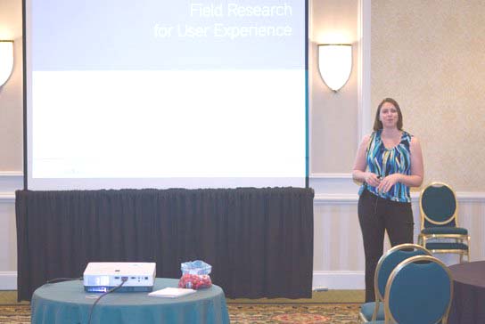
Figure 4: The author Danielle Cooley during her presentation on Field Research for User Experience.
There are a few different types of Field Research. The most commonly known is the formal Contextual Inquiry, introduced by Hugh Beyer and Karen Holtzblatt in 1997 [6]. If necessary, this technique can also be performed remotely, though doing so won’t reveal as much information about context and environment as one might hope. And on-site Usability Testing can be a nice way to get specific information about how well or poorly customers can use a product while also providing contextual information.
To conduct a Field Study, keep in mind the usual rules about participants’ rights, documentation, minimising bias, and building trust. There are practical issues to consider as well, such as the analyst’s physical security, site security issues that may prevent the use of recordings or photographs, productivity concerns on the part of the participants’ managers, and the pure logistics of finding and travelling to several different sites. Collecting such artefacts as photocopies, videos, photos, and office measurements is a key component of Field Research. Users’ homemade job aids often provide critical insight into the most challenging parts of an application or workflow.
For analysis and reporting, it’s helpful to compile the notes using affinity diagramming, mind mapping, or a similar process – either electronic or analogue. To accommodate short attention spans, the report should begin with a brief executive summary. Explain the methodology (number of participants, for what duration, over which dates). Report both positive and negative findings, and provide visual explanations of such findings whenever possible. Remember always to protect your participants’ anonymity, and include those artefacts!

Figure 5: Due Date Card catalogue at a community college in Ann Arbor, Michigan, USA. Including photographs like these can be helpful in illustrating Field Research findings.
Keynote: Jeffrey Zeldman: Content First
This year’s keynote was given over lunch on Friday. Jeffrey Zeldman is probably best known as the founder and executive creative director of Happy Cog and creator of A List Apart and its offshoots A Book Apart and An Event Apart. Given the undercurrent of Content Strategy at this year’s edUi, (Content Audits, semantic mark-up, hoarding), his keynote address was decidedly appropriate.
Jeffrey’s principal point was that good Web design starts with content. It’s difficult to design a Web site or other interactive product without a good understanding of the content it will house. Will it be image-heavy? Text-heavy? Will Widget X be described in one paragraph or one page? Without good answers to questions like these, it’s very difficult to design and build a good experience, and it’s nearly impossible to do so within typical timelines and budgets. Thus, content is a design problem.
Further complicating the life and work of the modern Web designer is the proliferation of small screens of varying sizes and aspect ratios. To accommodate such mobile devices, teams can design and code for every screen variant in existence or adopt a responsive design philosophy. Responsive Design uses CSS techniques, fluid grids, flexible images, and media queries to create a single codebase that displays content neatly on any screen size.
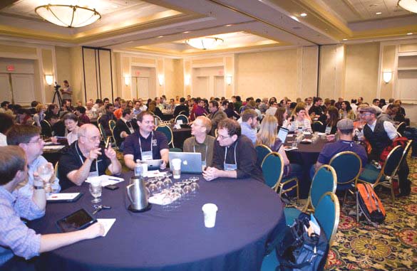
Figure 6: A full house for Jeffrey Zeldman’s keynote address entitled “Content First”
Jeffrey also brought up the use of ‘dark patterns’ on the Web [7], where unethical designers use tricks to get users to do things against their will. A simple and not-too-‘dark’ example is the opt-out checkbox for email subscriptions. An opt-in checkbox is a much more user-friendly paradigm. A more sinister example would be popping an ad when the user clicks a page background, when the user almost definitely only intended to bring focus back to the browser window. His main point in raising this was that dark patterns that hurt the user also hurt the business that uses them, through loss of customer loyalty and poor reputation.
Aside from avoiding dark patterns, good Web design starts with content. Many typical Web projects might start with committee feature requests, IT requirements, and ‘greeked’ visual design comps before content is even considered. By contrast, a better process would be to consider the content first, in the context of the user’s needs and business goals. Only then should the project team go on to User Experience activities, content governance models, design, and coding. Happy Cog doesn’t use greeked or other filler content for comps and prototypes, and, Jeffrey maintained, there’s no good reason for anyone else to do so.
In short, a Web designer’s main job is to serve the customer, and the best way to do that in 2011 is to start designing with content first, avoid dark patterns, and employ a responsive design to accommodate today’s small screens.
Not surprisingly, Zeldman is an engaging and entertaining speaker, and it really was a pleasure to hear him at edUi this year.
Toolbox: Unmoderated Remote Usability Testing: Good or Evil?
Kyle Soucy of Usable Interface felt that new tools like UserZoom, Loop11, and Keynote claim to provide valuable usability data for a tiny fraction of the cost of traditional, in-person usability testing. But there is much debate in the usability world about the real value of unmoderated remote usability testing. Does it provide real insight?, she asked. Can you infer the cause of users’ issues from pure task failure rates? Do study participants really include valuable feedback in comment areas, or do they tend not to bother? Kyle evaluated several of the dozens of different unmoderated remote usability testing tools in an attempt to answer those questions.
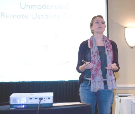
Figure 7: Kyle Soucy presenting on Unmoderated Remote Usability Testing.
The different tools provide different types and quantities of data. Most provide pure task completion rate information and analytics. Some also provide click count and clickstream data. Time on task and time on page are also metrics some of these tools report. Most, moreover, include some kind of satisfaction rating scale to gather subjective information about the users’ experiences.
To run a successful test, define the study goals and recruit participants. As with lab-based testing, it’s helpful to run a pilot session to work out any kinks in the test plan before launching the test and emailing the link to the participants. Being able to test a site with a large number of participants is one advantage of unmoderated remote usability testing. The cost of this type of testing is usually much less than that of traditional lab-based studies. Using a tool like this also eliminates the issue of no-show participants, and results come in very quickly.
On the other hand, some participants might only be interested in collecting the honorarium for the study, rather than providing valuable, actionable feedback. And, of course, what people say they do is rarely what they actually do, making the subjective satisfaction results unreliable.
Ultimately, nothing can fully take the place of watching participants in real time and being able to ask probing questions about what they are doing as they do it. While unmoderated remote testing has its place, it should be used as a complement to moderated research techniques, not as a replacement for them.
Web 101: Make Quality Content Count with Web Analytics
Rick Allen of ePublish Media began by saying the world of Web analytics is full of question and controversy. While most people agree that analytics are important, there is much disagreement about: which metrics matter the most; how accurate analytics really are, and; whether analytics findings are really actionable. While analytics reveal a lot about the ‘what,’ they do little to reveal the ‘why.’ It’s one thing to know that a certain page has a high bounce rate, but it’s an entirely different thing to understand why the bounce rate is so high in order that the right issues are addressed by the analyst.
To create a useful analytics framework, one must consider business objectives, user goals and what key performance indicators (KPIs) would best illustrate whether those business objectives and user goals are being met. Further, one must establish targets for those KPIs. If bounce rate is an important indicator, what constitutes a ‘good’ or ‘bad’ bounce rate? Finally, if demographic data are being collected, one must carefully consider which data (age? location? browser and version?) would provide the greatest insight.
Web analytics can validate assumptions and help prioritise brand attributes. If you suspect some of your content is outdated or confusing, poor analytics for that content might indicate those suspicions are correct. The analytics may also hint at the level of severity of any content or navigation problems.
Because analytics do not answer the critical ‘why’ question, it’s important to use them to augment, not replace, such qualitative research as usability testing and journaling studies. A low bounce rate might be a good thing, if it means the user is finding the information they need quickly. A high page hit count might be a bad thing, if it’s not really the page the users are looking for. Qualitative research will provide answers to these questions.
Web 101: Sophisticated Web Design: Taking your Site to the Next Level
In this talk, Wren Lanier of INM United described subtle techniques for making Web sites look more professional and trustworthy, pointing out that a single pixel in a repeating image can be enough to give a site the dimension and texture found on professionally designed sites. By pointing out some of these tricks, she intended to make better design accessible for groups that may have amateur designers on staff but are not able to afford the full-time efforts of a professional designer.
Her first point: design for your content. (Seeing that ‘Content First’ thread emerging again here?) Every site’s content is unique, so it’s very likely that your content won’t fit neatly into an existing template. Although creating new layouts takes more time than using out-of-the-box templates, the result is a better overall experience.
Second point: Use whitespace to your advantage. When designers fill the entire page with content or images, it’s often difficult for users to determine which content is most important. Consider not using a sidebar or extra images or copy.
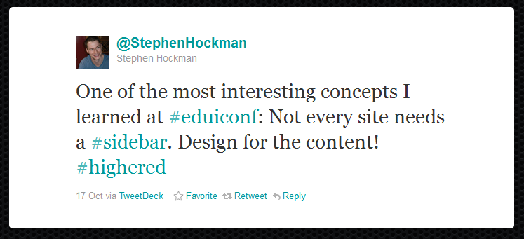
Figure 8: Stephen Hockman tweet in reaction to Wren Lanier’s presentation.
Third point: take care of your typography. This is where many Web designers fail the ‘common sense’ test. Readability is the most important thing about typography, and it’s entirely possible to find Web fonts that are both beautiful and readable. When choosing typography, consider size, contrast, colour weight, and space for comfortable visual flow. While experts may be able successfully to mix a large number of typefaces, novices should limit themselves to two or three in a single site or page.
Fourth point: Texture. It was during this part of Wren’s talk that Jeffrey Zeldman was nodding so much we thought his head might come clean off. The world is not flat, and your Web site shouldn’t be, either. By introducing subtle colour variations, gradients, shadows, and textures, even the novice designer can make a Web site feel more ‘real.’ She didn’t really address the subjective part of determining what is and is not appropriate in a texture treatment. I suspect many people using garish background images may well consider them simply ‘texture.’
Fifth point: Colour! There is no one good, or bad, way to use colour in Web design. For some sites, really bold colour can be an asset. For others, a fairly subtle and muted palette would be more appropriate. Remember, too, that certain industries need not feel tied to a single colour. Not every financial services Web site needs to be green, for example.
Sixth and final point: Responsive Web design. The concept was addressed many times throughout the conference, and Wren gave us one more parting reminder of the value of this development philosophy.
Fun: Richmond Folk Festival
The organisers of edUi intentionally scheduled the conference to conclude just before the start of the Richmond Folk Festival. Several of us sauntered over to the festival on Friday evening to enjoy some food, drink, and fine music. There were fried Oreos, people. Fried Oreos!
Conclusion
Overall, my experience of edUi was incredibly positive. The event was very well-run. The only significant glitch was with the hotel’s WiFi on Thursday, and that was completely resolved by the next day. The delegates were clever, engaged, and interested, and the speakers were all very knowledgeable about their subject matter.
The inadvertent focus on Content Strategy, Responsive Design, and HTML5/CSS3 was a very faithful reflection of the issues currently faced by Web design teams everywhere, both within and beyond Higher Education and libraries.
The bonus? Food! Christopher Schmitt’s talk, ‘HTML5 Does All That… AND I Can Haz Cheeseburger? You bet!’ included actual cheeseburgers for the delegates. Todd Zaki Warfel served beer in his Prototyping Workshop. And several other speakers included candy and other tasty incentives for audience participation. It definitely kept things interesting and amusing.
edUi 2012 will be held in Richmond, Virginia, USA over 24-26 September 2012. Three 2012 keynotes – Jared Spool, Jeff Gothelf, and Jay Blanchard – were announced on 28 February 2012, and the rest of the programme promises to be just as exciting. I hope to make it, and I hope to see you there!
References
- The Third Annual edUi Conference http://eduiconf.org/
- The Third Annual edUi Conference tracks http://eduiconf.org/schedule/
- The Third Annual edUi Conference speakers http://eduiconf.org/speakers/
- Persona (marketing) – Wikipedia, the free encyclopedia
http://en.wikipedia.org/wiki/Persona_%28marketing%29 - In this context, 'journaling' refers to a type of user research in which participants work autonomously and record their thoughts about their experiences in an electronic or written journal, which is later returned to the user researcher for analysis. See
http://usability.jameshom.com/journals.htm and
http://usability.jameshom.com/selfrept.htm - Hugh Beyer, Karen Holtzblatt. Contextual Design: Defining Customer-Centered Systems (Interactive Technologies). 1997, Morgan Kaufmann, ISBN-13: 978-1558604117
- Home: Dark Patterns: User Interfaces Designed to Trick People http://wiki.darkpatterns.org
Author Details
Danielle Cooley
Independent User Experience Consultant
Email: danielle@dgcooley.com
Web site: http://dgcooley.com
Twitter: @dgcooley
Danielle Gobert Cooley is an independent User Experience consultant with over 12 years of experience in a multitude of user research and usability analysis methods. She has applied her skills to a wide variety of applications, including hardware, Windows, Web, telephone, and mobile. Her successful designs have been implemented at such large and small, public and private companies as Pfizer, Sargento Foods, Navy Federal Credit Union, Enterprise Rent-A-Car, and MasterCard Worldwide.
Active in the field, she was the founding Vice President of the Boston chapter of the Usability Professionals Association and served on the committees of the 2007, 2008, and 2012 Usability Professionals' Association Annual Conferences. She has a BE in Biomedical and Electrical Engineering from Vanderbilt University in Nashville, Tennessee, and a MS in Human Factors in Information Design from the Elkin B. McCallum Graduate School of Business at Bentley University in Waltham, Massachusetts.
